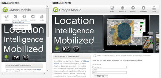
GMapsMobile.com, which looks almost identical to the existing site on a desktop web browser.
However, if you open it on your mobile phone or tablet in horizontal or vertical orientation, you will see some subtle changes making it readable without pinch/zoom. These changes are in-line with our design and development approach and practices for all user experience projects moving forward. We will continue to leverage the latest web standards to create a seamless, platform agnostic experience.
You can expect some new HTML5 enabled features coming soon to our web site as we see the adoption of HTML5 compliant browsers increase among corporate visitors.]]>