

As you learn how to use the Data Browser, Components, and Functions, you have a palette with near unlimited flexibility.
Using charts and selectors to filter and navigate information
 One of the key differences between shared data exploration views posing as dashboards is the level of control over user experience, which is mandatory for “no training required” dashboards. In my case I wanted a pie chart that could filter a second chart, and also use a combo-box to make a selection.
I found a property called “selected item” which is specifically designed to let other components control the selected item. The result is a really nice user experience. The expressions window has a nice scripting wizard to make it extremely easy for non-developers to create simple or sophisticated selection behaviors.
One of the key differences between shared data exploration views posing as dashboards is the level of control over user experience, which is mandatory for “no training required” dashboards. In my case I wanted a pie chart that could filter a second chart, and also use a combo-box to make a selection.
I found a property called “selected item” which is specifically designed to let other components control the selected item. The result is a really nice user experience. The expressions window has a nice scripting wizard to make it extremely easy for non-developers to create simple or sophisticated selection behaviors.
Create New Dashboard Data
 If you are building dashboards, there are plenty of scenarios where you need more data to improve the user experience. Most modern BI tools provide an ability to add columns with calculations and Antivia is no different. However, Antivia DecisionPoint goes one step further, allowing you to add new metadata sets that can improve the user experience, provide labels, or bridge data imported from live data sources.
Change Measures Dynamically
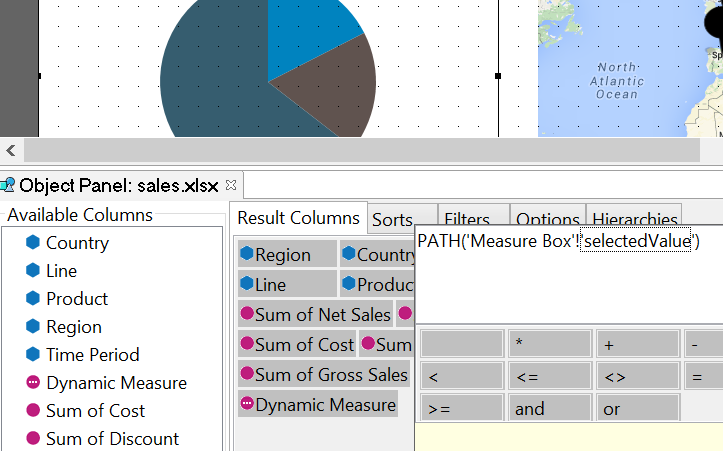
 Dragging and dropping measures into a chart makes building charts and maps simple. However, most business users want access to multiple measures / metrics. One simple function and now any chart in my dashboard can be dynamically driven by my dropdown. If you are building DecisionPoint, this Path() function is one you will use a LOT.
PATH(‘Measure Box’!’selectedValue’)
Dragging and dropping measures into a chart makes building charts and maps simple. However, most business users want access to multiple measures / metrics. One simple function and now any chart in my dashboard can be dynamically driven by my dropdown. If you are building DecisionPoint, this Path() function is one you will use a LOT.
PATH(‘Measure Box’!’selectedValue’)
Where to Learn More Tech Tips to Master DecisionPoint
 ]]>
]]>