Learn from an industry expert how visual storytelling with maps can help relay more information, faster.

Hosted by CMaps Analytics with guest Author and Data Visualization expert Alberto Cairo – Originally aired March 31, 2016.
[ezcol_1third]
[/ezcol_1third] [ezcol_2third_end]
Maps are the hottest data visualization trend in editorial, consumer technologies, and enterprise. Regardless of software tools, the insights provided through spatial relationships can be extremely useful for data visualizations.
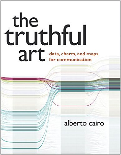
Join us for a “Mapify your KPI” web event where our spacial guest Alberto Cario will share his experiences, and real world editorial examples from his upcoming book The Truthful Art. Get inspired with new visual storytelling tips using maps.
Watch Now On-Demand [/ezcol_2third_end]In this webinar you will learn:
- Incredible examples of effective story telling with maps
- The creative process for designing maps that are effective.
- ASK THE EXPERTS: You will have the opportunity to ask questions in a live Q&A
Recommended Reading from Alberto
Thematic Cartography and Geovisualization
How Maps Work: Representation, Visualization, and Design
How to Reach Alberto
http://www.thefunctionalart.com/
Books by Alberto Cairo
[ezcol_1half]
BUY NOW ON AMAZON![/ezcol_1half] [ezcol_1half_end] [/ezcol_1half_end]
Watch On-Demand


